Web design
Pittsburgh Children's Museum Redesign


Project description
Project description
Project description
The Pittsburgh Children's Museum is a popular destination for both children and parents. This project aims to redesign their website, enhancing navigation efficiency while capturing the playful spirit that the museum embodies.
Timeline
This project took place during the Fall 2023 semester, spanning from October to November (~ 5 weeks).
Background
This project's scope includes conceptualization, information architecture, and final website design. Designers are asked to redesign the landscape of the Pittsburgh Children's Museum homepage to tailor it to the previously identified user archetypes.
Please view the rest on a tablet or desk top.
Process
Process
Research & Planning
In this project, we identified five main user archetypes:
Planning Parents
Engaged Educators
Curious Kids
Supporting Patrons
New-in-Town Parents
By analyzing each archetype and considering their comprehension levels, time constraints, and goals, we were able to pinpoint the essential features and characteristics that we need to take into consideration while conceptualizing.
Based on our conceptualization, we've identified the key features and needs for the different demographics who will frequent the website, as highlighted on the concept map above. To summarize, the key problems and needs are:
Children need a space to extend their museum experience online.
Parents and educators need access to logistical information, including transportation, tickets, and museum hours.
Patrons and frequent visitors need to stay informed about special events and manage their patron status.
The general public needs their questions answered and the ability to reach staff members for special inquiries.
These insights have guided us to make the homepage a directional hub, designed to direct different users to the appropriate pages that best satisfy their needs. This approach ensures that each user group can easily find the information and resources they seek. The site map captures our findings and effectively redirects the users according to their needs.
We also examined the current Pittsburgh Children's Museum and its online photography to understand the atmosphere and ethos of the establishment. We found that the Pittsburgh Children's Museum places a strong emphasis on building and crafting, with a primary mission to support children in having hands-on experiences and learning through interactive play.
Design & Prototyping
Based on our research findings, we've decided to integrate elements of interactive play into our design. To achieve this, we're incorporating shapes that evoke the look and feel of building blocks, reflecting the playful nature of a children's museum. We drew inspiration from a photography piece uploaded by the Pittsburgh Children's Museum, which captures this essence perfectly, and from that image, we derived the color palette for our design.
There were multiple variations of lo-fi prototypes on how the different shapes could be incorporated into the website. To evoke a sense of playfulness and mimic the building blocks that kids play with, the information are all in a blocky format.
After considering usability and the need for variety, given that both children and adults will be visiting this website, we've decided to further explore the first option. We have adjusted the sizes of the square blocks and the information they contain to better accommodate the needs of our diverse audience.
We wanted to highlight key information that every type of user would find helpful, specifically the museum's hours and schedules. Regardless of other features, the primary reason most people visit the website is to plan their visit. Additionally, we have highlighted the events as a separate section to help users quickly locate activities and imagine themselves enjoying a visit to the museum.
In this prototype, the third event was open in order to showcase what that interaction would look like. There will be a brief description and a call for action button below the description. This is intended to make users interested in the events and explore more.
Optimization
After conducting peer critiques and usability testing, we've identified several items and features that require alterations.
Smoother visual experience: Users prefer a seamless design with better alignment of elements, such as ensuring floating cards and event sections are cohesive, and avoiding disruptive elements like the green block.
More effective display of information: Users need quick access to information, with clear proximity between related content like event lists and descriptions, and the inclusion of titles to help navigate content efficiently.
Solution
Solution
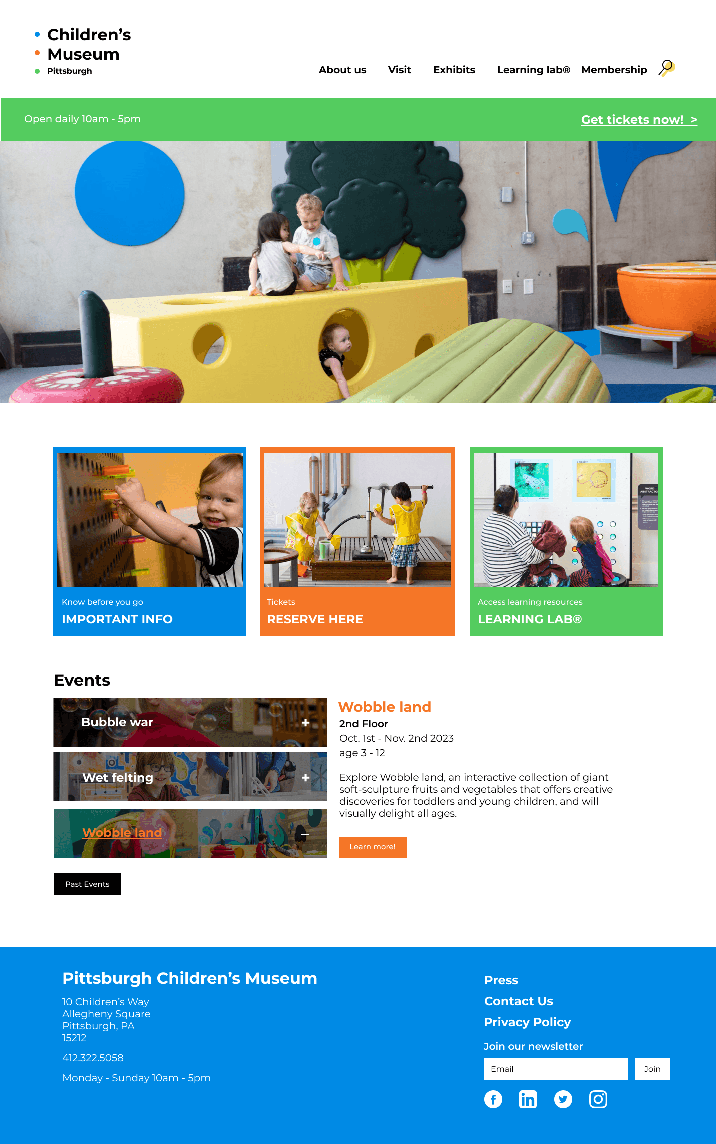
The Pittsburgh Children's Museum's online space has been thoughtfully designed to cater to a diverse audience, including both children and adults, whether they're first-time visitors or returning patrons. This design solution seamlessly blends playful, childlike elements with a user-friendly interface, ensuring that the website not only evokes a sense of joy but also serves as an efficient information hub, enabling users to quickly and easily find the answers they need. This balance between creativity and functionality reflects the museum's mission to engage and educate its visitors, both online and in person.
Prototypes
Find me on other platforms
© 2024 – Holly Jiayi Wang
Made with love🫶
All rights reserved
Find me on other platforms
© 2024 – Holly Jiayi Wang
Made with love🫶
All rights reserved
Find me on other platforms
© 2024 – Holly Jiayi Wang
Made with love🫶
All rights reserved